GAMGOSGAMES

GAMGOSGAMES

TYCOONCOIN

CASE STUDY

CLIENT

Tycoon Limited is an Australian based start-up. Their product TycoonCoin is different from ordinary cryptocurrencies as it actively engages in the marketplace to raise its post-ICO token value and maximize investors’ profits.

TASK

To design a website that aims to generate ICO presale leads. Tokens are available at a reduced cost to attract large and recognized investors. A successful pre-sale shows early interest in the project and builds confidence and  trust in the new token performance.

GAMGOSGAMES

CASE STUDY

CLIENT

GloBLD platform is set up in accordance with the CityGML, but also offers room for expansion and includes information about buildings, transportations roads, tunnels, bridges, relief, land use, vegetation, water bodies, city furniture ets.
As Richard Baan (GloBLD Technical Director) says: “The Netherlands is facing a large number of challenges in the coming years. All buildings must be energy neutral by 2050. That means a huge improvement in sustainability in the coming years. But how do you know which measures are the best? As a housing corporation, should you strive for energy label B from 2020 or should you do all the adjustments immediately to achieve an energy-neutral property? “

TASK

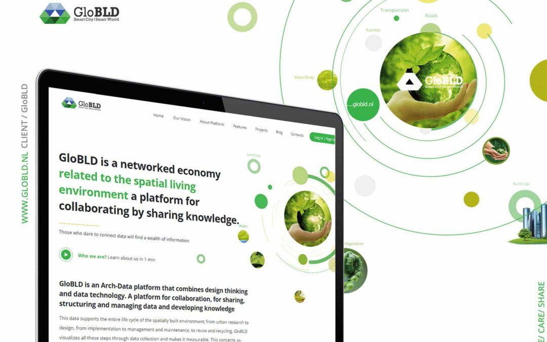
The previous GloBLD website needed a redesign. The client wanted a fresh and open look and feel of the interfaces and flexible, extendable and ever evolving platform as functionality.The goal of the web site is to educate visitors about all GloBAL platform features and also to boost the credibility and gain more trust from it’s current and future clients. A modern design and easy, understandable content yet technical and informative was part of the task. All this was missing in the previous website.

SOLUTION

GloBLD offers the most diverse and complete information for the built environment. GloBLD mission is to centralize available information in one, easy-to-use place for potential customers and all humans on the planet.

With close collaboration with the GloBLD team, we explored several different design ideas for the website to find various routes GloBLD could take to achieve their goals.

Using their core values of optimism, transparency, approachability, innovativity and ever evolving ecosystem as inspiration I proposed my vision for the User Interfaces. Also developed a visual design system of reusable components in order to create predictable user experience and make it easier for the client to create new screens after the project.

GAMGOSGAMES

Other Projects

TYCOONCOIN

TYCOONCOIN

TYCOONCOIN

CASE STUDY

CLIENT

Tycoon Limited is an Australian based start-up. Their product TycoonCoin is different from ordinary cryptocurrencies as it actively engages in the marketplace to raise its post-ICO token value and maximize investors’ profits.

TASK

To design a website that aims to generate ICO presale leads. Tokens are available at a reduced cost to attract large and recognized investors. A successful pre-sale shows early interest in the project and builds confidence and  trust in the new token performance.

SOLUTION

Complex blockchain technology creates a lot of possibilities for technically savvy people but at the same time it prohibits mass users from widespread usage. Currently there is no central platform or organization to explain to  the mass user the core blockchain  concepts and processes. So the blockchain technology is existing but it is as if it is not existing for most people as they don’t know how to use it.

My task was to create a user experience that helps anybody with no prior experience or knowledge to use blockchain products and services. Users are not interested in the technology by itself; they are interested in their experience and achieving their goals, helped by technology. So to make the technical complexity of the blockchain disappear  I created a simplified and familiar user-interactions environment though consistent and familiar UI patterns I strived to design trustworthy experiences by creating a platform that looks familiar to the users and removing blockchain complexity on top of traditional products like – worldwide loans.

TYCOONCOIN cripto

Other Projects

Landing Page

Landing Page

LANDING PAGE


I’m writing this article to showcase all elements that need to be included into conversion focused landing pages. Visitors may land on your homepage of your website after clicking on some advertisement (banner ad for example). Most home pages have low conversion rates. Why? Because they are not optimised for that purpose. Companies offer several services or products that are listed on the website. Having too many options usually prohibits users from action.

If you want to convert visitors into customers it is better to have a specific page that is optimised for a specific audience. Landing pages are carefully designed simple pages with one message, one offer and one call-to-action. In the landing page it is excellent to educate your users about your service or product you provide, not about the history of the company or other related events. You are not selling service or a product you are selling benefit from that service or product.

Many landing pages have way too much information on them – many images, too much text, too much stuff and options. Less is more. So on the landing page everything that can distract visitors needs to be removed – no top menus, no side bars, no social media icons at the top. 

Landing Page

The value proposition needs to be short, specific, compelling and to connect emotionally with users. The specific headline will not work for every one but it is better to take a targeted approach for your content and to speak to a specific user group. Another crucial and important element is the Call-to-action button. Make just one straight to the point CTA that compel users to act.

Below the fold this is where you go deeper and provide more details about your service/product. Comparison to other services, feature lists, other pain points can be addressed as well. Writing with empathy will make users realize that someone understands their problems and will have the feelings that the landing page is written especially for them and will be more interested in what you have to say.

  • A specific limited time offer will work for “hotter” traffic (remarketing) while
  • More informative beautifully designed landing page with extended time for taking action is more suitable for “cold” traffic.

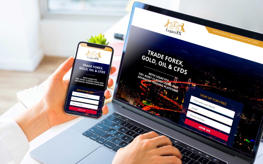
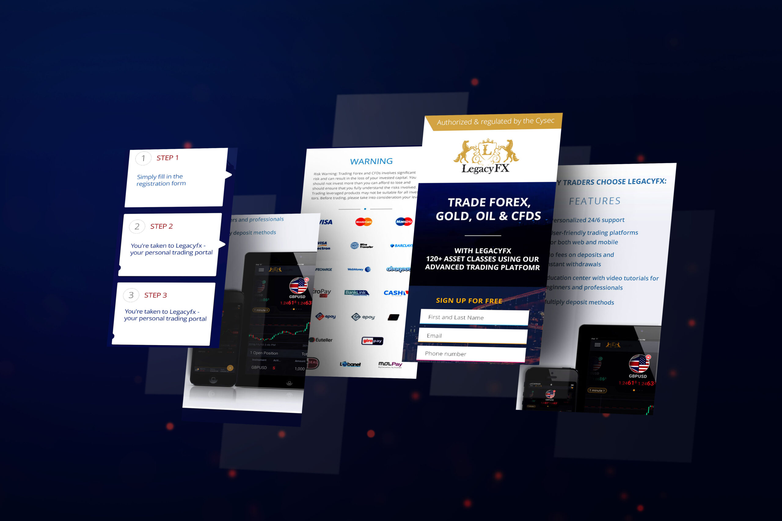
In this example the goal of the company is:-to build trust and attract more customers to use their trading platform

STRATEGY AND SOLUTIONS IN MY DESIGN:

  • Explain the features well, and show technical abilities and assets.
  • Make the CTA button and form clear and visible.
  • Easy Subscription process in 3 steps.
  • Make visitor feel that it is user-friendly ,easy learnable and achievable for every body and they are supported all the time – 24/6
  • Show personality, make them feel like they are already successful traders
  • Build trust by some social-proved feedback of customers that are using the platform already. People adapt their behavior influenced by others’ behavior. (Small section in the header)
  • Cool looking hero picture makes users dream about their success using the platform and increases chances for positive experience.

A/B TESTING

Conduct some A/B testing. Data doesn’t lie. So it is better to make decisions based on data rather than on assumptions.

Split testing is when you show different designs of the same landing page to different segments of users and compare which variant drives more conversions. But you may not know why. Was it the image, the content, the font, colors or CTA that made the users act.

Here the multivariate test can be of help. In multivariate tests you can test every possible combination of UI elements that you might want to change. Let’s say you want to change the header picture and the CTA button of the landing page. That means four possible combinations with those variables to be tested in order to determine which change or combination of variables has the greatest impact. That means you need to test at least four variants of your landing page. Then you need to have huge traffic and a lot of time in order to reach statistical significance. That makes multivariate tests for some projects unusable. Multivariate tests might be applicable when you want to refine an already good designed and working landing page.

OPTIMIZED FOR MOBILE

LANDING PAGE

Other Projects

OPTIMIZED FOR MOBILE

LANDING PAGE

Other Projects

OPTIMIZED FOR MOBILE

LANDING PAGE

Other Projects

GloBLD

GloBLD

GloBLD

CASE STUDY


CLIENT

Passion and drive for a better world is an important motivation for GloBLD. The vision and dream of Frans Leurink, the founder of GloBLD, is to develop a platform where it will be possible to easily bring closer contact and communication between people, companies and the spatial environment on the global level. GloBLD is the online knowledge platform for real estate projects.

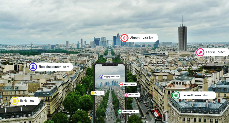
I was genuinely interested in the GloBLD project, since the first meeting, as I’m inspired in general in making the world a better place. It also relates to my second masters thesis – in my second major – Science, Technology and Society.- “Co-shaping of governance and technology in the development of mobile telecommunications”. Where I analyzed how mobile technology and society co-shape and mutually influence its development. I imagine as mobile communications developed from a technical innovation to an essential infrastructure that penetrates entire society the same way we can develop a 3D representation of the spatial environment on the globe, the entire built and naturally existing environment worldwide. Back in 2008 the world worked toward global mobile infrastructure so that it would be possible European GSMs to work in the US infrastructure as well. In less than 15 years not only mobile phones are connected but everything is connected. With technology like Augmented reality the world is brought closer more than ever.

GloBLD platform is set up in accordance with the CityGML, but also offers room for expansion and includes information about buildings, transportations roads, tunnels, bridges, relief, land use, vegetation, water bodies, city furniture ets.
As Richard Baan (GloBLD Technical Director) says: “The Netherlands is facing a large number of challenges in the coming years. All buildings must be energy neutral by 2050. That means a huge improvement in sustainability in the coming years. But how do you know which measures are the best? As a housing corporation, should you strive for energy label B from 2020 or should you do all the adjustments immediately to achieve an energy-neutral property? “

LIST A TOKEN
TASK

The previous GloBLD website needed a redesign. The client wanted a fresh and open look and feel of the interfaces and flexible, extendable and ever evolving platform as functionality. The goal of the web site is to educate visitors about all GloBAL platform features and also to boost the credibility and gain more trust from it’s current and future clients. A modern design and easy, understandable content yet technical and informative was part of the task. All this was missing in the previous website.

 SOLUTION

GloBLD offers the most diverse and complete information for the built environment. GloBLD mission is to centralize available information in one, easy-to-use place for potential customers and all humans on the planet.

With close collaboration with the GloBLD team, we explored several different design ideas for the website to find various routes GloBLD could take to achieve their goals.

Using their core values of optimism, transparency, approachability, innovativity and ever evolving ecosystem as inspiration I proposed my vision for the User Interfaces. Also developed a visual design system of reusable components in order to create predictable user experience and make it easier for the client to create new screens after the project.

see also