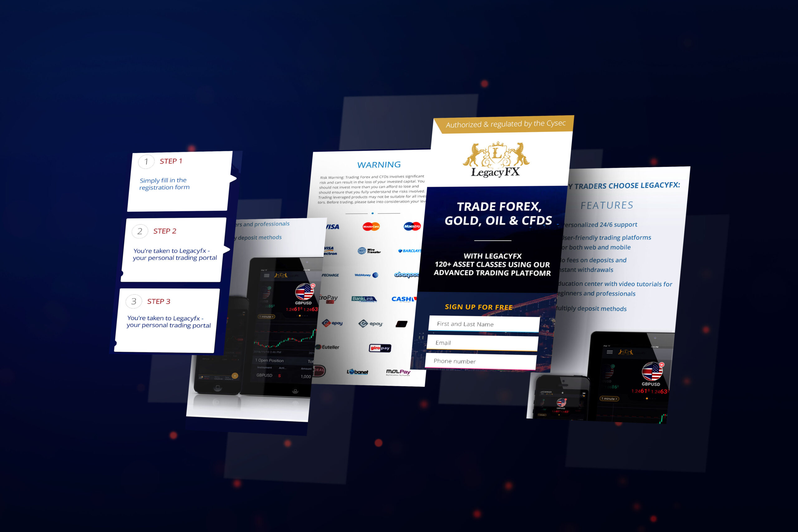
Landing Page
LANDING PAGE
I’m writing this article to showcase all elements that need to be included into conversion focused landing pages. Visitors may land on your homepage of your website after clicking on some advertisement (banner ad for example). Most home pages have low conversion rates. Why? Because they are not optimised for that purpose. Companies offer several services or products that are listed on the website. Having too many options usually prohibits users from action.
If you want to convert visitors into customers it is better to have a specific page that is optimised for a specific audience. Landing pages are carefully designed simple pages with one message, one offer and one call-to-action. In the landing page it is excellent to educate your users about your service or product you provide, not about the history of the company or other related events. You are not selling service or a product you are selling benefit from that service or product.
Many landing pages have way too much information on them – many images, too much text, too much stuff and options. Less is more. So on the landing page everything that can distract visitors needs to be removed – no top menus, no side bars, no social media icons at the top.

The value proposition needs to be short, specific, compelling and to connect emotionally with users. The specific headline will not work for every one but it is better to take a targeted approach for your content and to speak to a specific user group. Another crucial and important element is the Call-to-action button. Make just one straight to the point CTA that compel users to act.
Below the fold this is where you go deeper and provide more details about your service/product. Comparison to other services, feature lists, other pain points can be addressed as well. Writing with empathy will make users realize that someone understands their problems and will have the feelings that the landing page is written especially for them and will be more interested in what you have to say.
- A specific limited time offer will work for “hotter” traffic (remarketing) while
- More informative beautifully designed landing page with extended time for taking action is more suitable for “cold” traffic.
In this example the goal of the company is:-to build trust and attract more customers to use their trading platform
STRATEGY AND SOLUTIONS IN MY DESIGN:
- Explain the features well, and show technical abilities and assets.
- Make the CTA button and form clear and visible.
- Easy Subscription process in 3 steps.
- Make visitor feel that it is user-friendly ,easy learnable and achievable for every body and they are supported all the time – 24/6
- Show personality, make them feel like they are already successful traders
- Build trust by some social-proved feedback of customers that are using the platform already. People adapt their behavior influenced by others’ behavior. (Small section in the header)
- Cool looking hero picture makes users dream about their success using the platform and increases chances for positive experience.
A/B TESTING
Conduct some A/B testing. Data doesn’t lie. So it is better to make decisions based on data rather than on assumptions.
Split testing is when you show different designs of the same landing page to different segments of users and compare which variant drives more conversions. But you may not know why. Was it the image, the content, the font, colors or CTA that made the users act.
Here the multivariate test can be of help. In multivariate tests you can test every possible combination of UI elements that you might want to change. Let’s say you want to change the header picture and the CTA button of the landing page. That means four possible combinations with those variables to be tested in order to determine which change or combination of variables has the greatest impact. That means you need to test at least four variants of your landing page. Then you need to have huge traffic and a lot of time in order to reach statistical significance. That makes multivariate tests for some projects unusable. Multivariate tests might be applicable when you want to refine an already good designed and working landing page.


OPTIMIZED FOR MOBILE

Other Projects
OPTIMIZED FOR MOBILE

Other Projects
OPTIMIZED FOR MOBILE


Comments.